While I know my way around very well this still feels very redundant – the data source is the same, the formulas are the same, actually everything besides the object type is the same. Enter the new crosstab to chart conversion.
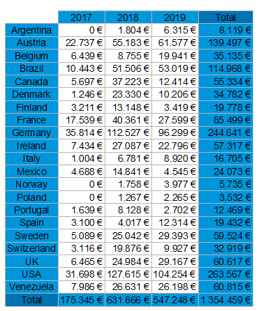
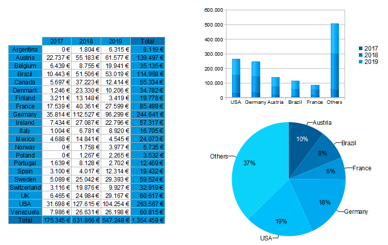
Let’s start off with a quite simple crosstab: sales per country and year. The configuration looks like this …
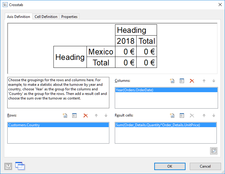
… which results in this crosstab in the report:
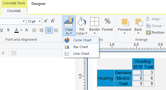
To convert this crosstab to a chart, simply right click on the crosstab in the “Objects” window or choose the new context ribbon command:
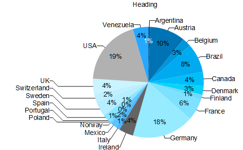
The untweaked result then looks like this:
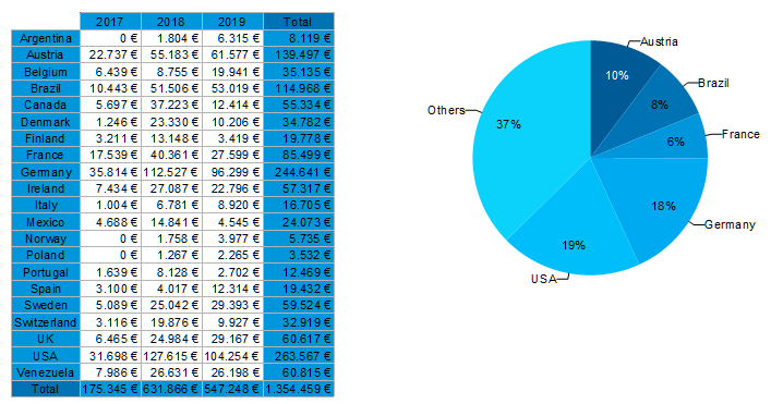
As there are rather many countries with a very small share the one thing we’ll change is to introduce a minimum share of 5% – and our dashboard is beginning to take shape:
Now let’s convert the crosstab to a bar chart additionally. The pie visualization “loses” a dimension of data as the sales per year are not visible from it. That’s something a stacked bar chart (to which the multi dimensional crosstab will be converted automatically) can do better. After applying some tweaks like sorting the data by value and restricting it to remove some clutter (all of this described in this blog post) here’s the final dashboard:
All of this is now a matter of minutes with all the redundancy removed – instead of fiddling with the data and formulas, you and your users can finally concentrate on just the layout and look and feel of the report once the data has been brought into shape in the crosstab.
There’s even more icing on the cake – you can do the same stuff vice versa – if you have a chart, just right click it in the object window to copy it as crosstab – it couldn’t be any easier to toggle between the two types. BTW: creating crosstabs will be a breeze in LL24, but that’s another story. Stay tuned.
