New Service Pack 27.002 for List & Label and the Report Server

The new service pack for List & Label 27 brings many enhancements and improvements especially for the new Web Report Designer as well as for Delphi and .NET developers. In addition, the new drag & drop interface for charts now also supports the selection of an aggregate function. The report template preview in the Report Server uses the new Web Report Viewer, styled according to the applied Report Server customization. Read our blog post for more highlights. The individual entries have been taken directly from the English readme.

Report Server 27: New Features and Improvements

white label support and custom branding

In the Report Server’s most current version, a few more exciting new features have been implemented, as a response to some customer requests. Overall, the new Report Server now visually integrates better into your application. Also, in addition to new actions for planned reports, it also offers additional enhancements for Excel export. Service Pack 27.001 will provide customers with a completely new preview.

Creating Charts via Drag & Drop

Drag and Drop for Donut Chart

List & Label’s chart dialog offers a load of possible customizations. However, as always, with great power comes great complexity. Even creating a simple pie chart could have taken some time if you’re not yet familiar with List & Label’s chart features. As you can already easily create crosstabs via Drag & Drop, and we just recently improved the table’s drag & drop features, offering a thorough D&D support for charts was the next logical step on our path to a simpler, more intuitive end user desktop designer.

Service Pack 26.001 for List & Label and the Report Server
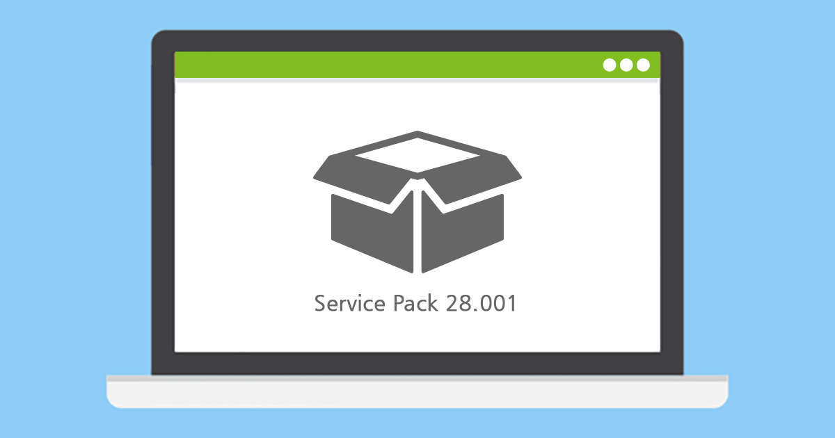
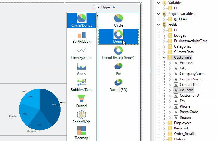
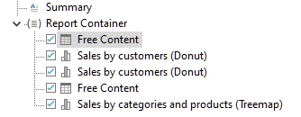
The first Service Pack for List & Label 26 has been released. What are the new features and improvements? In this blog post we give you an overview. Each entry was taken directly from the English Readme.

Finally – a Glance in the Crystal Ball

An often required feature for "this cannot be done" type of problems is looking into the future. Things like "don't print this group if it doesn't contain record xy" or "print a reference to the page number of an item that's printed way later". Before List & Label 26, there was no simple solution to this and the magic had to be done in the application if possible at all. Starting with List & Label 26, we'll introduce a new feature that's aimed at solving exactly challenges like this.

Interactive Reports with List & Label

Today, modern reports must be designed for more than just one purpose. In addition, "all" data should be contained as simply as possible – but presented in a clear and structured way. With List & Label such multifunctional reports can be easily realized. Interactive elements allow a single report to cover several scenarios, while selection options further enhance the report. This makes reports more comprehensive and informative and can be easily operated by the user.

Create Functional Dashboards in Seven Easy Steps

Complex data is usually processed visually in dashboards in order to be able to capture trends, outliers or up-to-date data at a glance. The design of dashboards depends on important details. These details make the difference between whether the information is interesting for the target group and whether conclusions can be drawn from it or not. For example, a bar chart is better to capture than to work your way through hundreds of table entries. Dashboards are often used incorrectly and are hopelessly overloaded with numerous different charts and gauges, such as traffic lights, speedometers and hardly readable tables.